

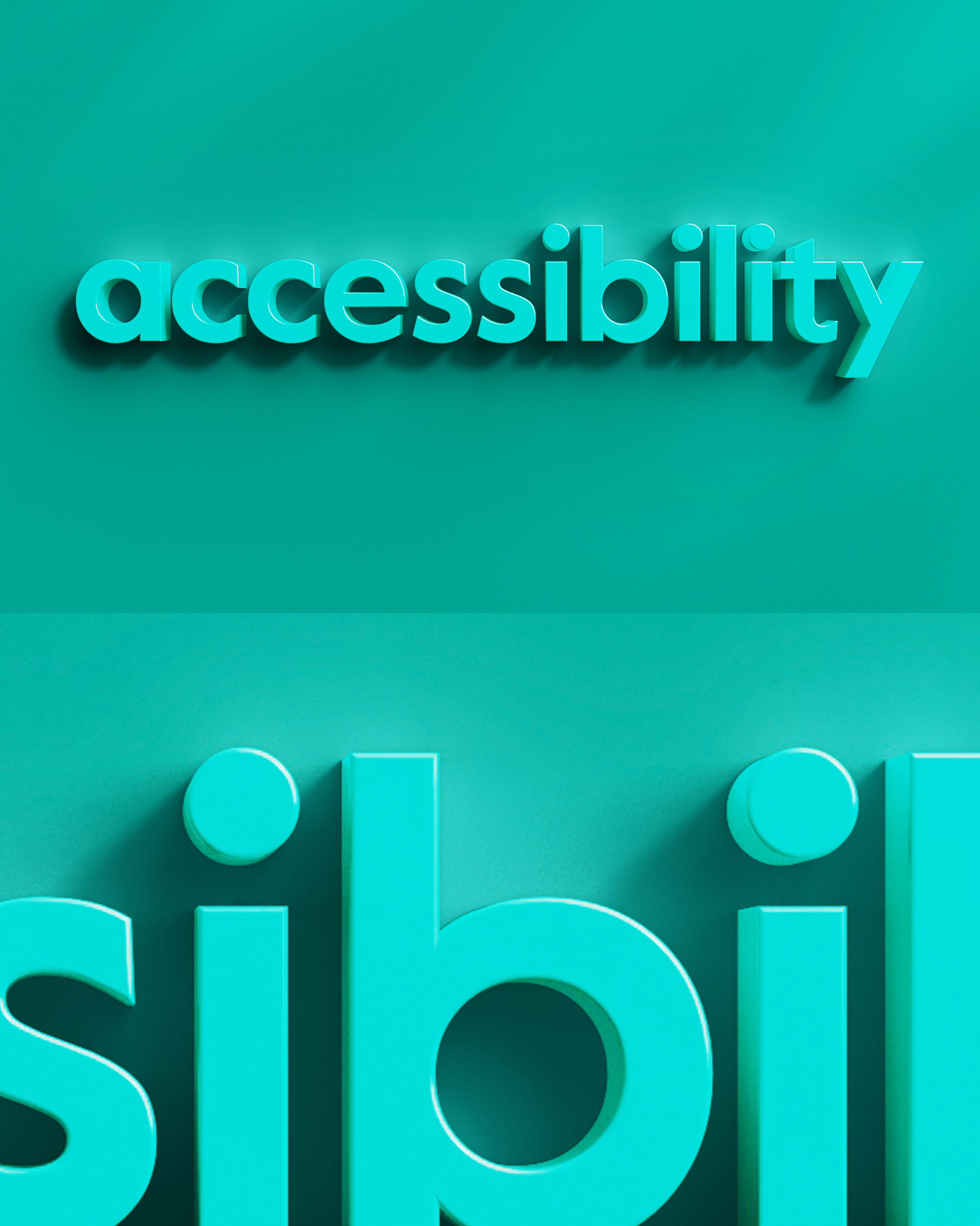
Alongside Cambridge OCR’s identity refresh, we were tasked with creating a brand film to communicate their new brand positioning and purpose. We began with a simple notion of displaying each of the key pillars in an impactful way that could cut through, using 3D type to make the branding feel more tactile and to also amplify the new colour palette.
This was then complemented by a range of hand-drawn animations and illustrations that could bring a layer of personality to the piece and provide a playful approach to the often serious nature of examinations. This suite of design assets were then available to be used across the broader comms campaign.


CREDITS:
Client: Cambridge OCR
Cambridge OCR Team: Tim Anderson, Diane Thorburn, Anthony Day, Jenny Murfitt-Barber
Creative Director: Sam Harvey
Art Director: Sonia Lamba-Tucker
Motion Design: Leo Fernandes
Illustration and Animation: Emma Kelly
Collaboration with Ratchet
Ratchet Team: Katherine Nathan, Pauline Russell, Mary Gregory, Gareth Thomas