

As a small start-up business, wellness brand Dru Thai Yoga wanted to have an impact with a vibrant and energised approach to get their name known while feeling approachable and personable.
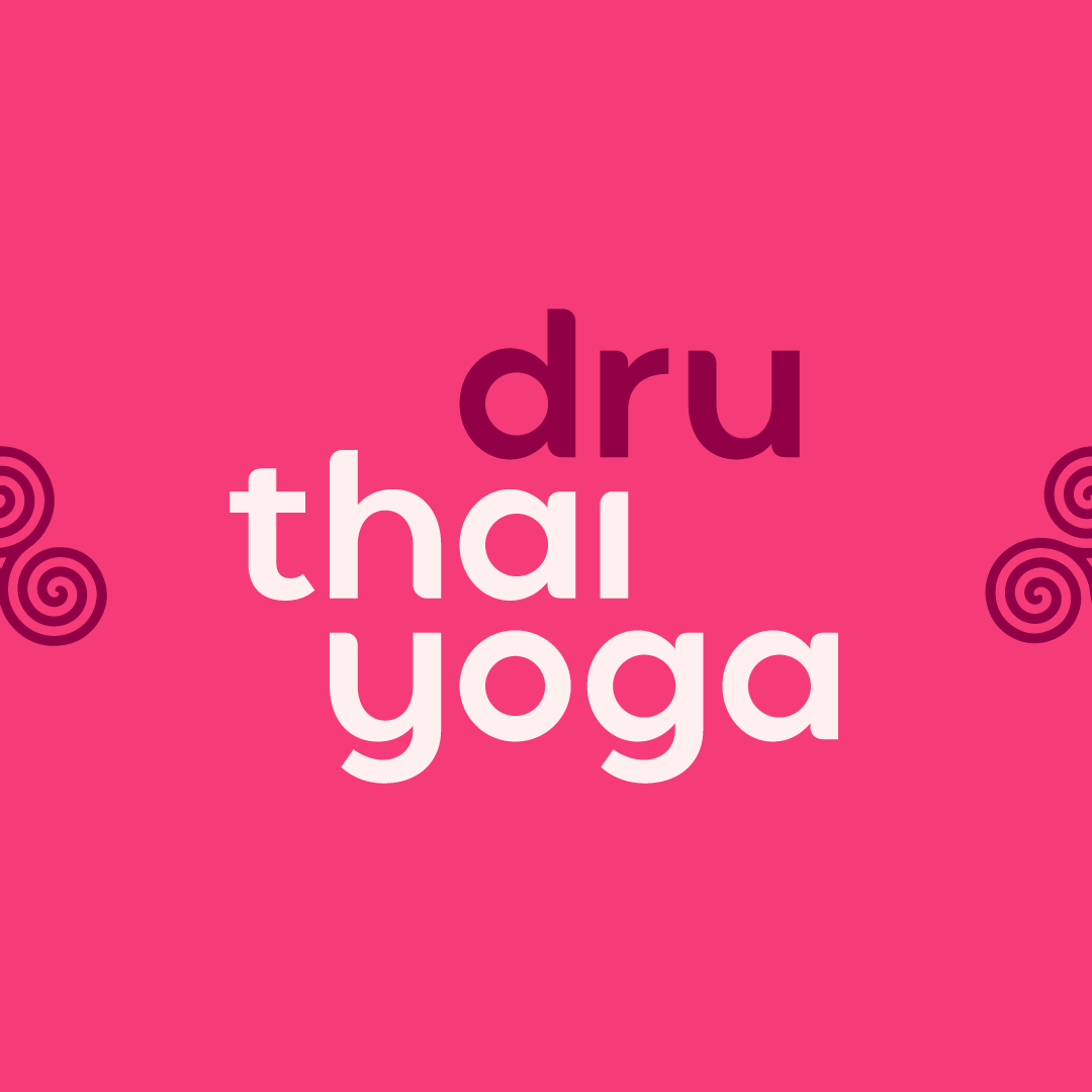
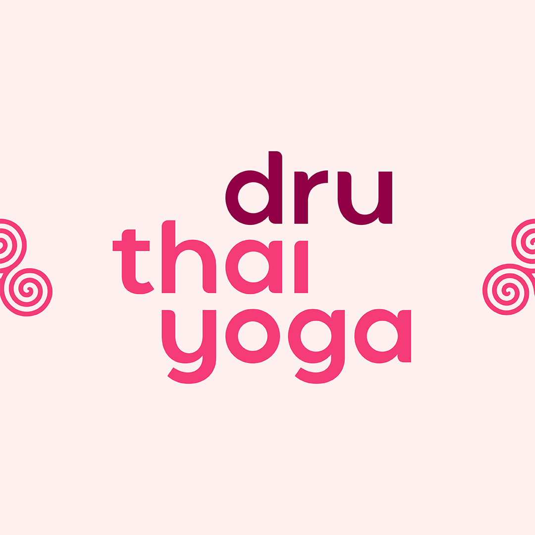
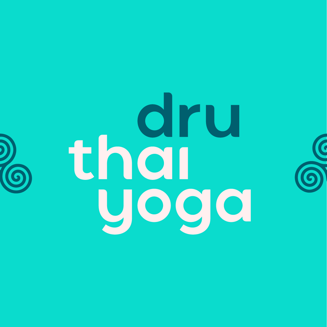
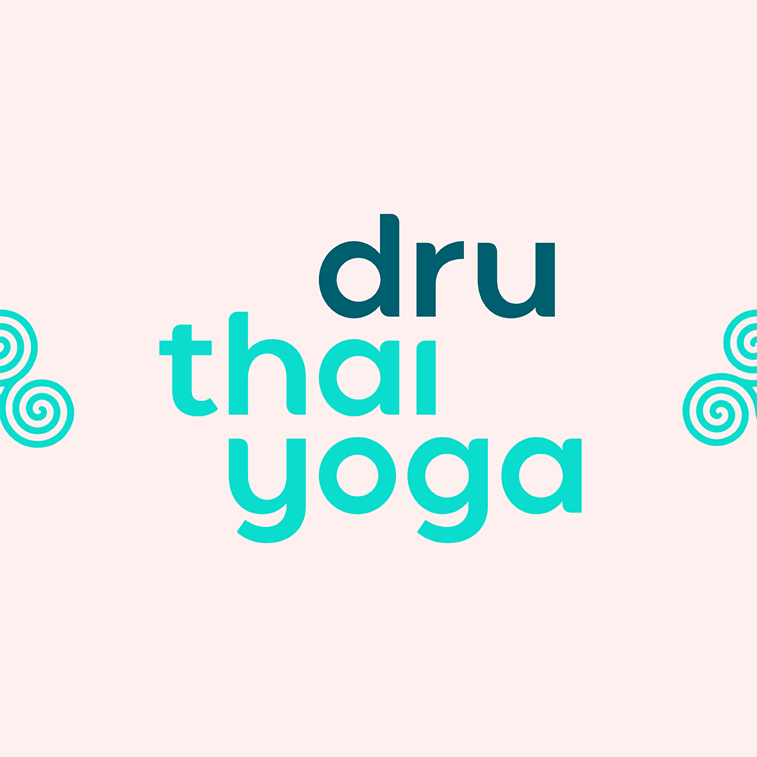
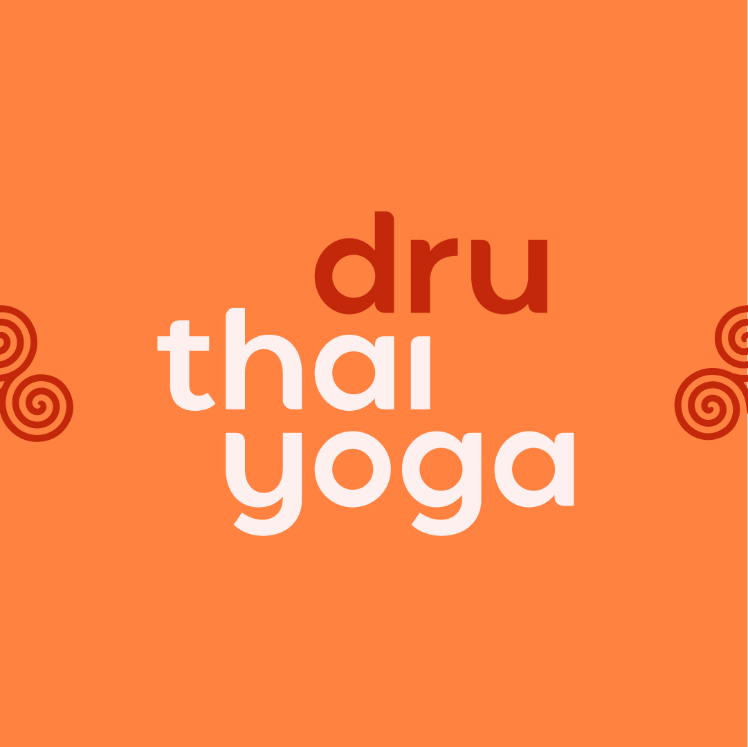
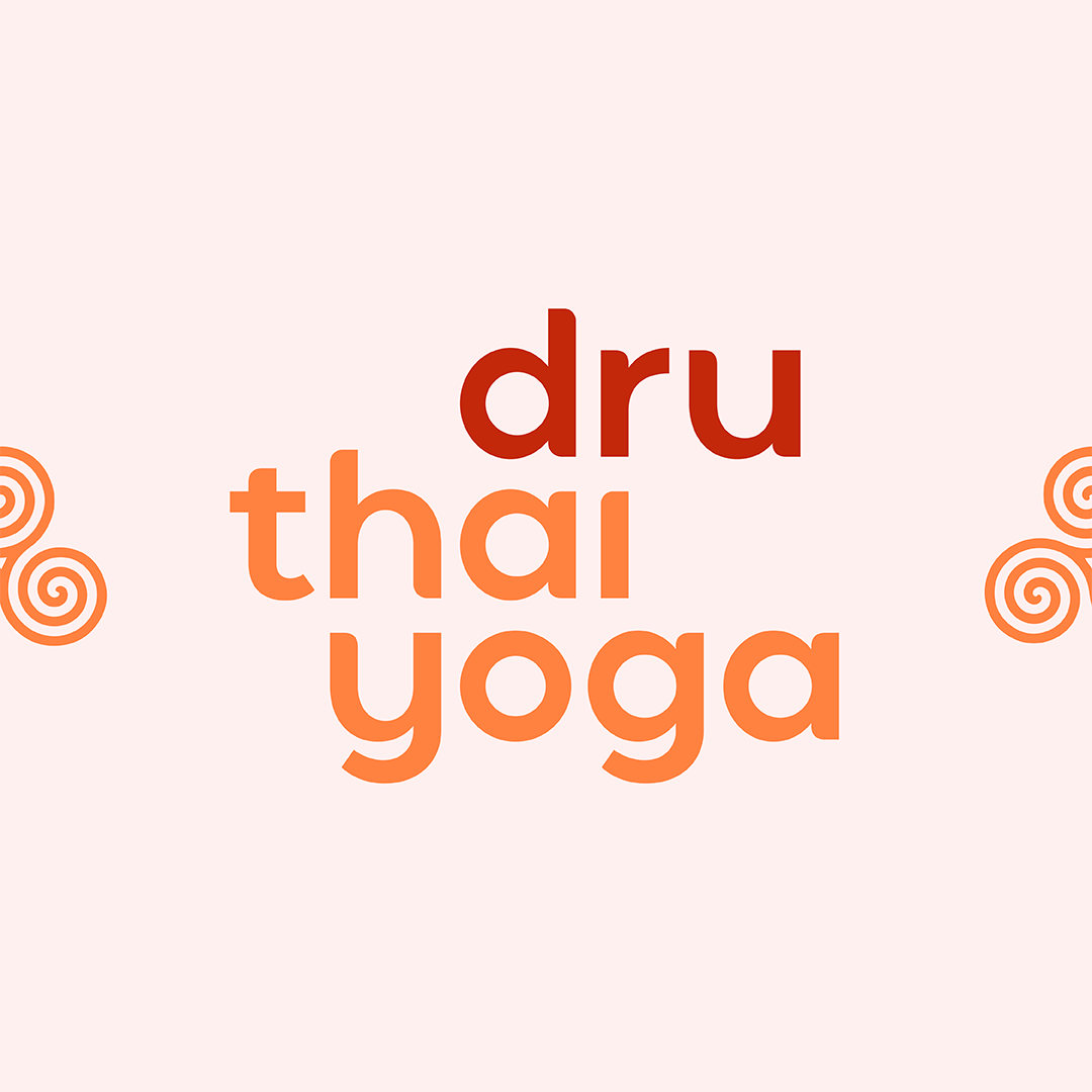
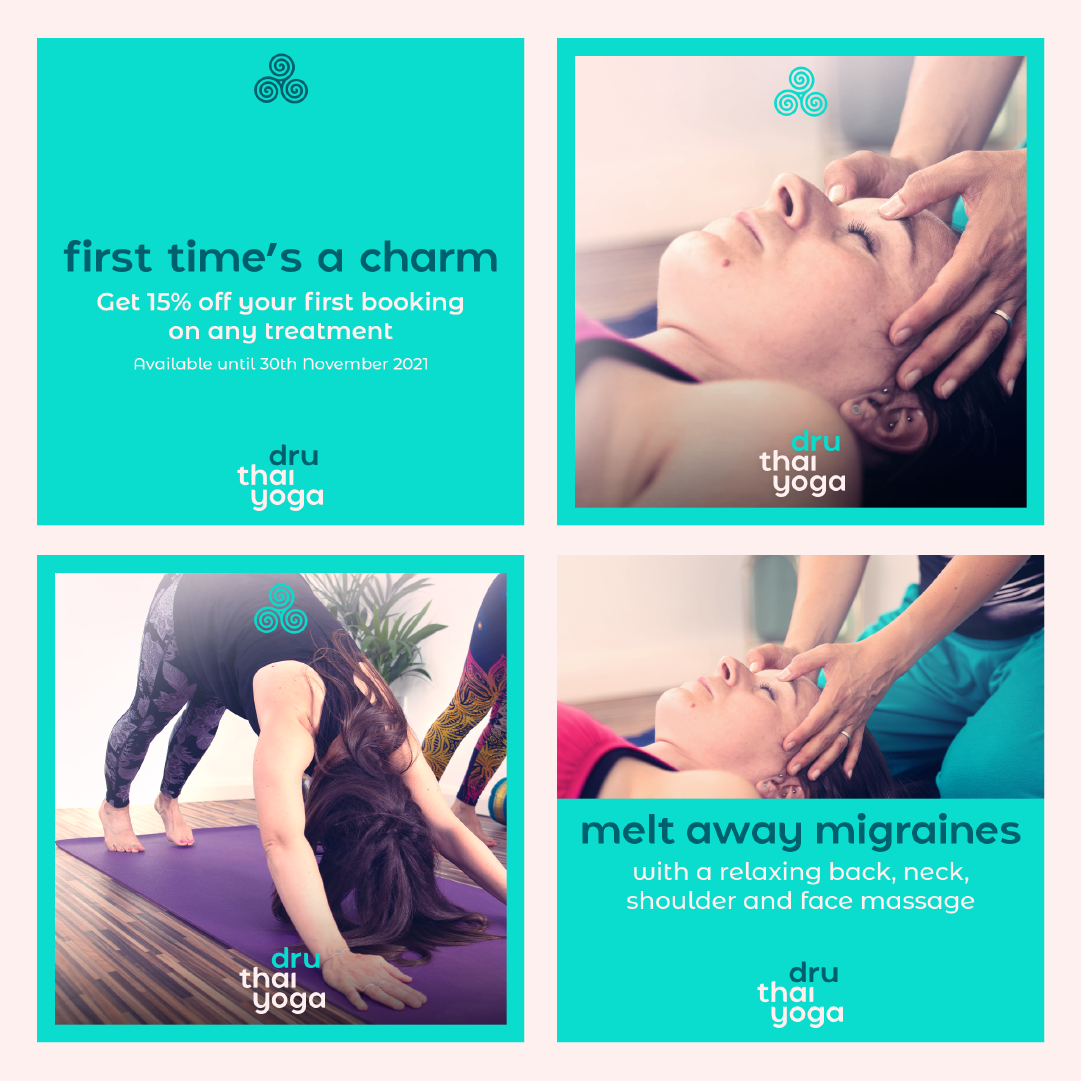
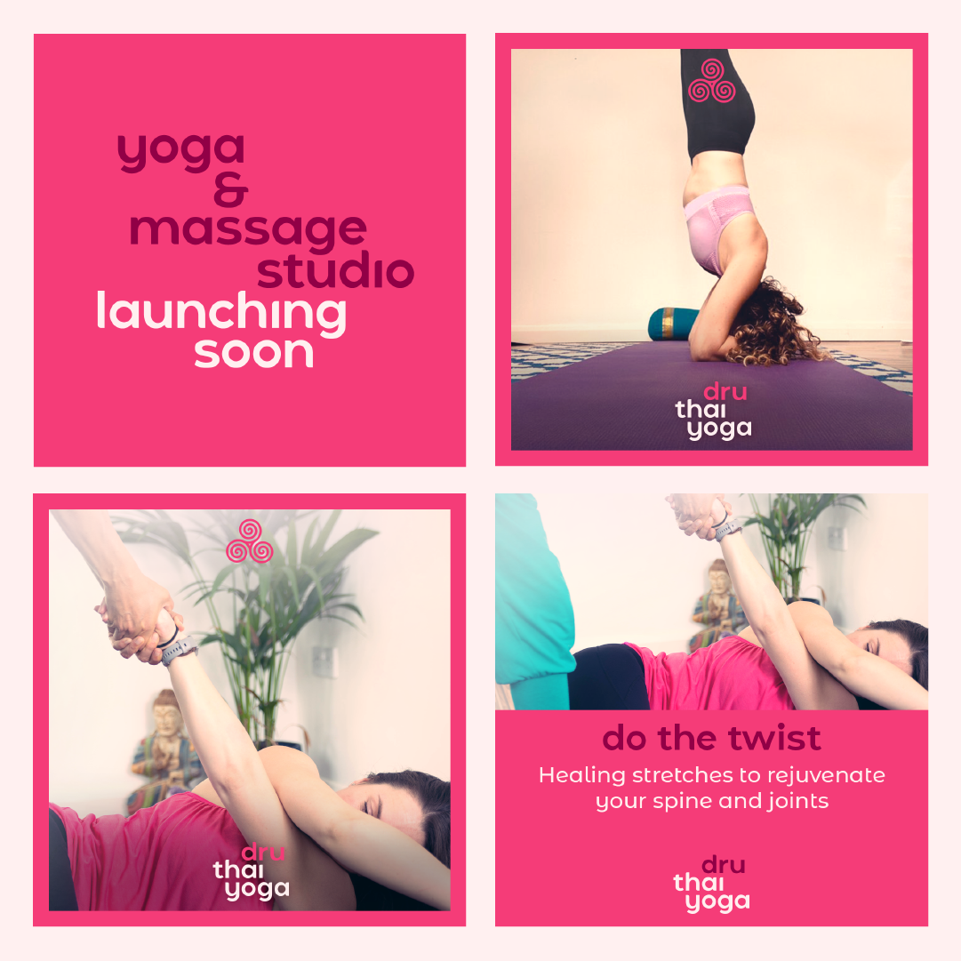
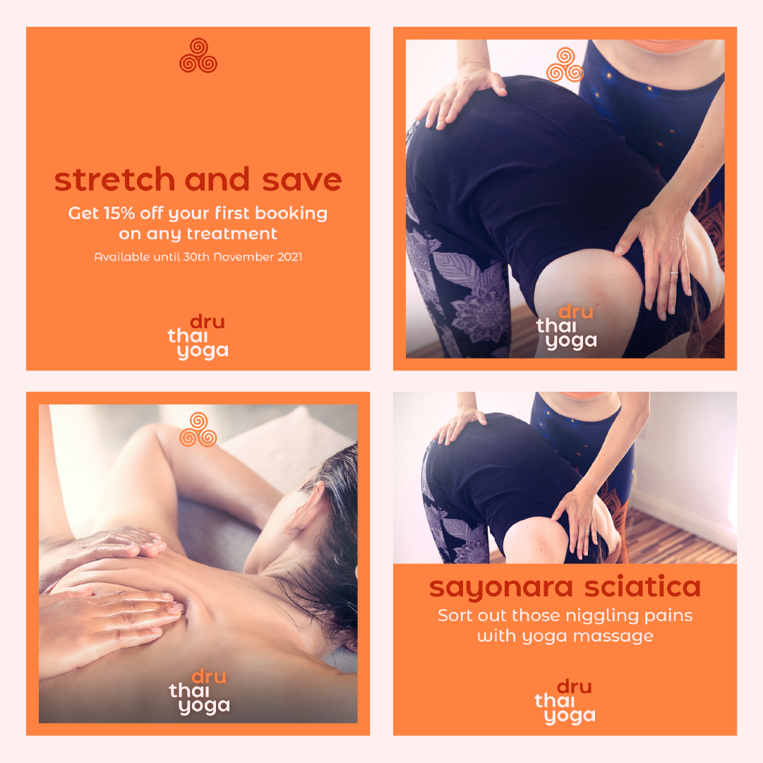
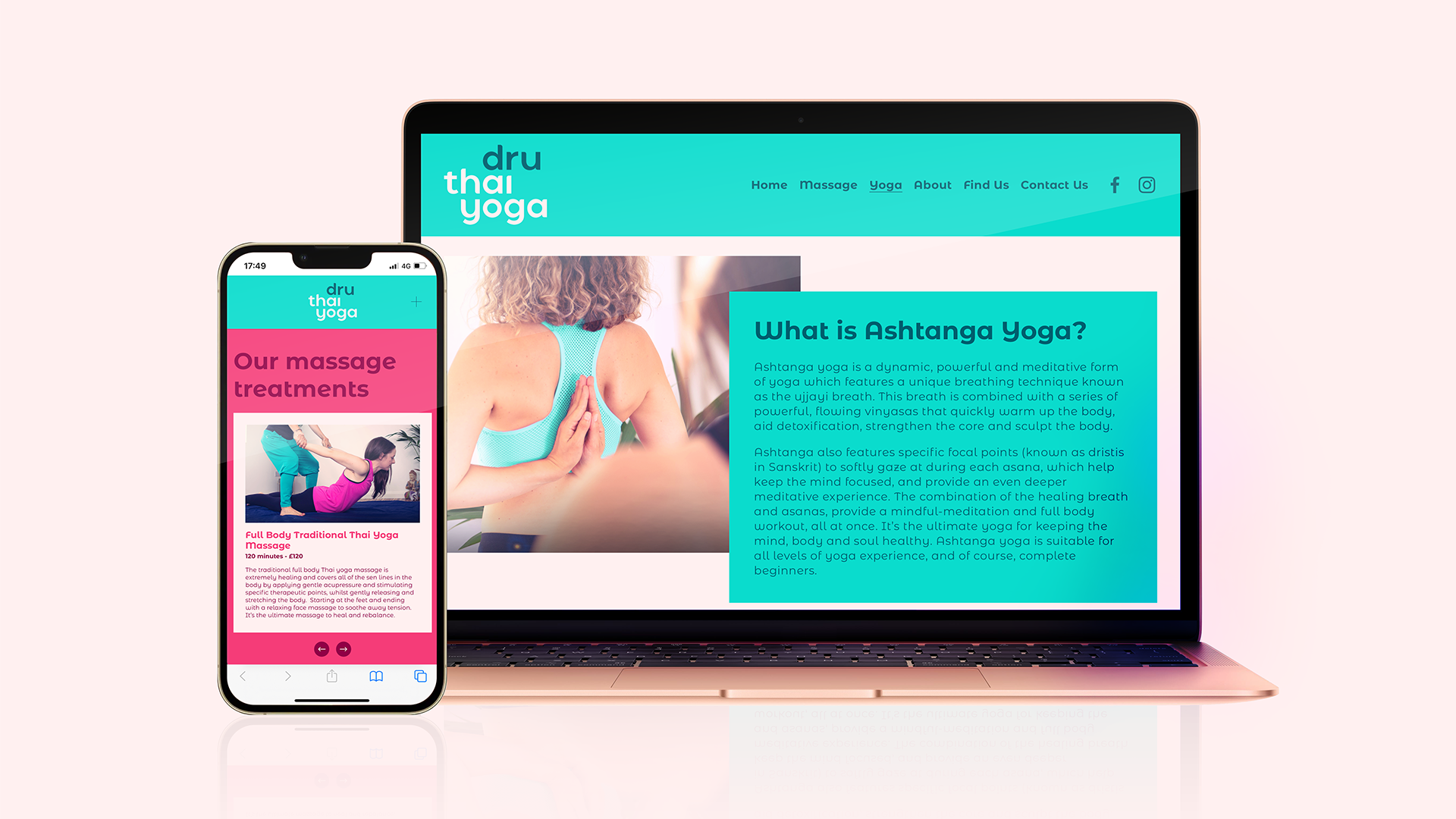
The brand starts with its palette. An intense range of colour options designed to inject personality and playfulness into the comms, particularly across social platforms. The three signature colours of Amber, Jade and Ruby are at the heart of all the visuals, complimented by darker accent colours and a warm, lighter tone. This along with the simple lowercase wordmark and triskelion icon gives the brand a simple set of components to work with.
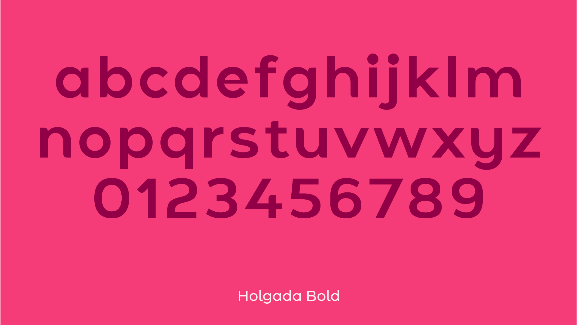
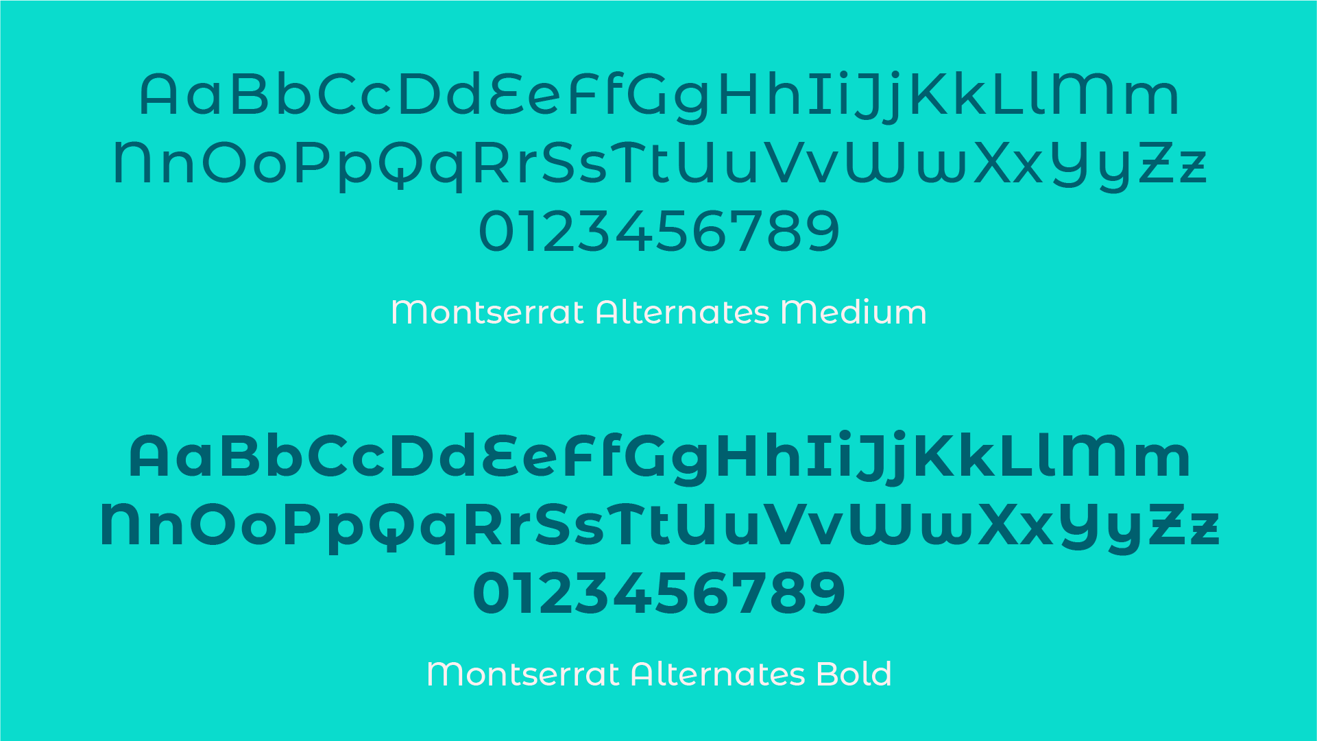
The logo mark is reinforced in messaging with a rounded, lowercase typeface for headlines, while the rounded features subtly continue in the body font for larger pieces of typography.
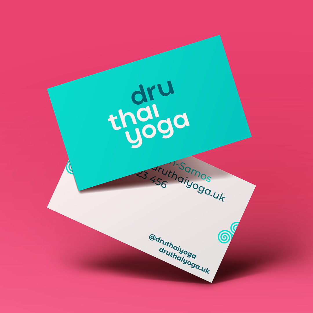
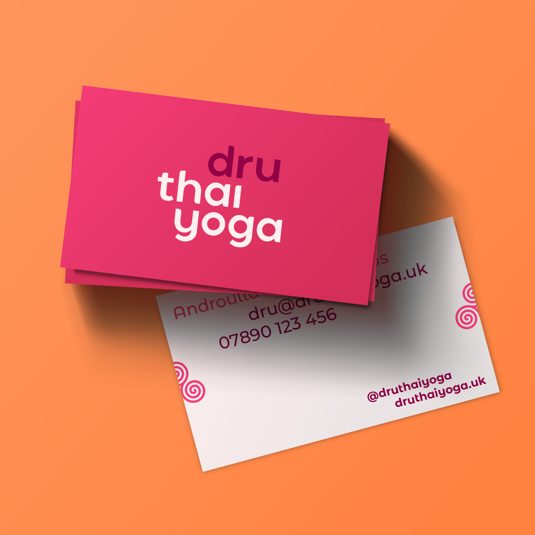
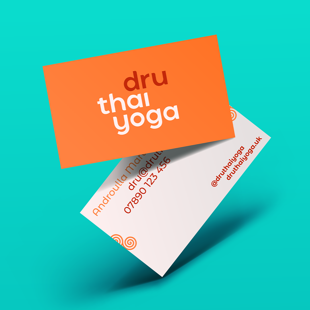
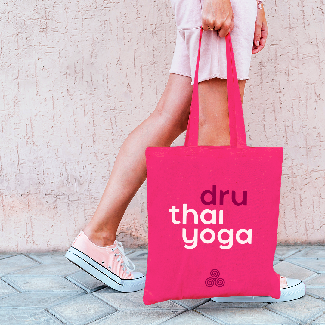
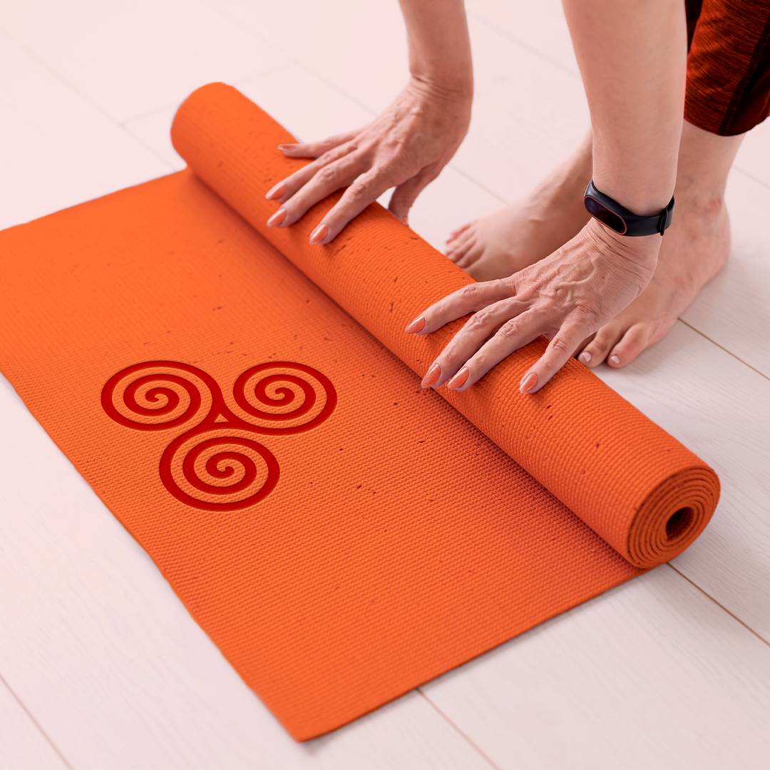
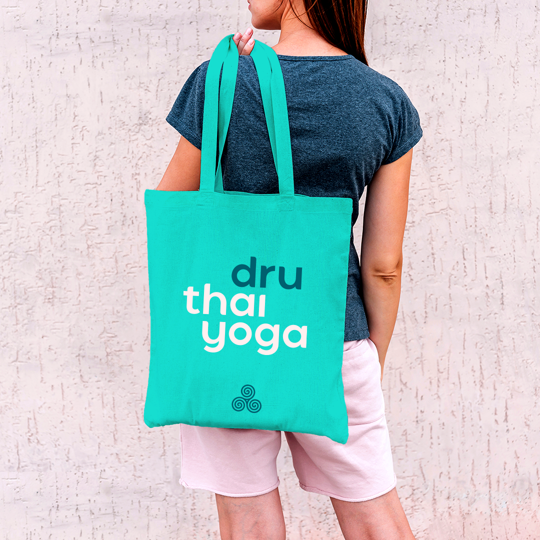
The simplicity of the brand components makes it extremely adaptable for use, whether it be on comms, stationery or merchandise, allowing the business to grow naturally into its new look and feel.
Finally, the digital presence is addressed with a suite of simple layouts that convey Dru Thai Yoga’s playful tone of voice across social and web platforms, while the colour instantly inject the brand’s warm and invigorating charm.
CREDITS
Photography: Julian Martin-Samos