
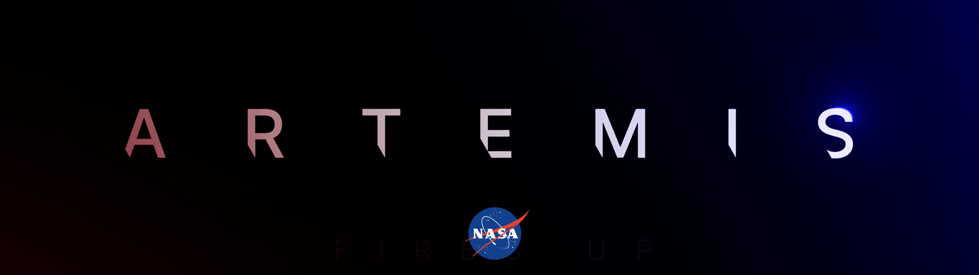
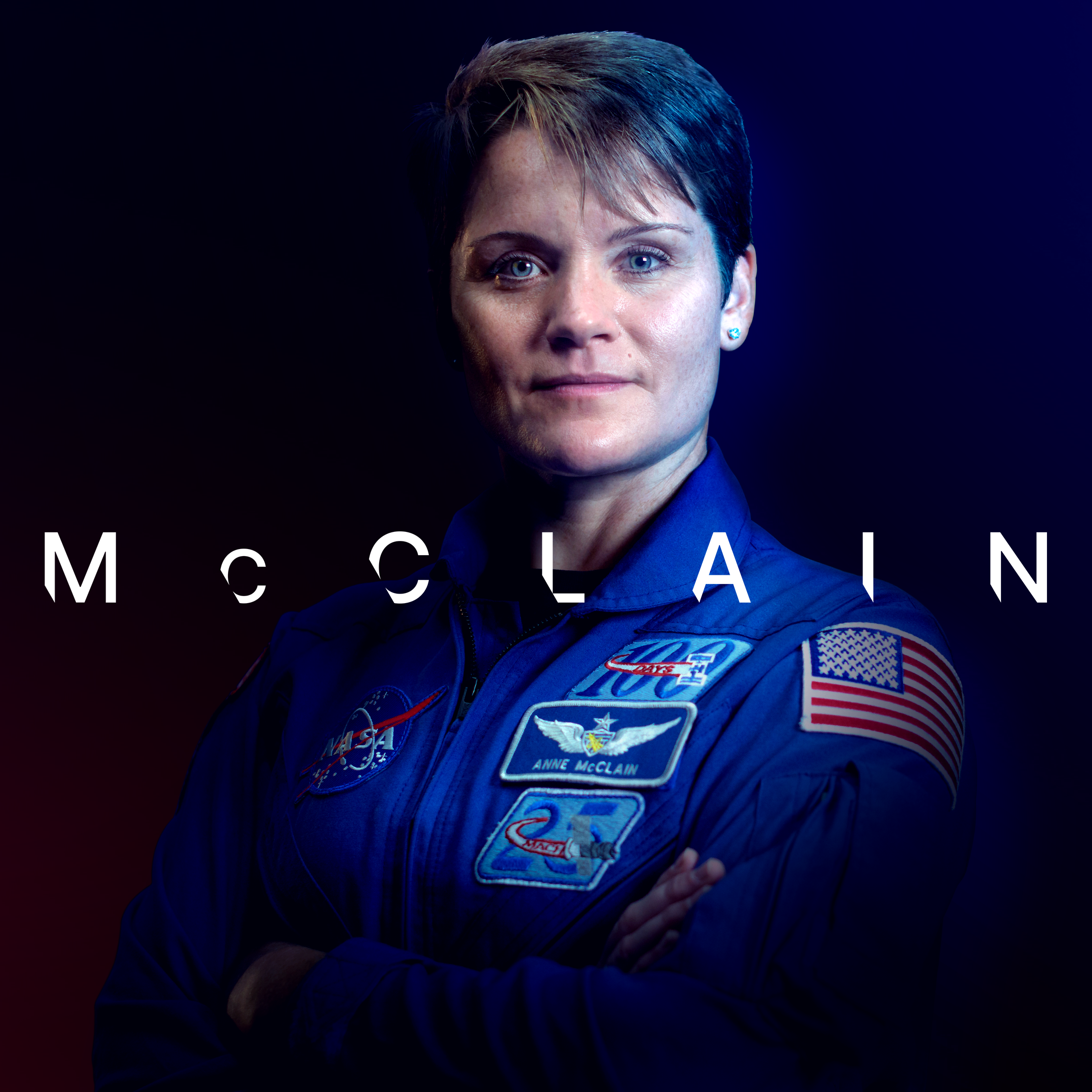
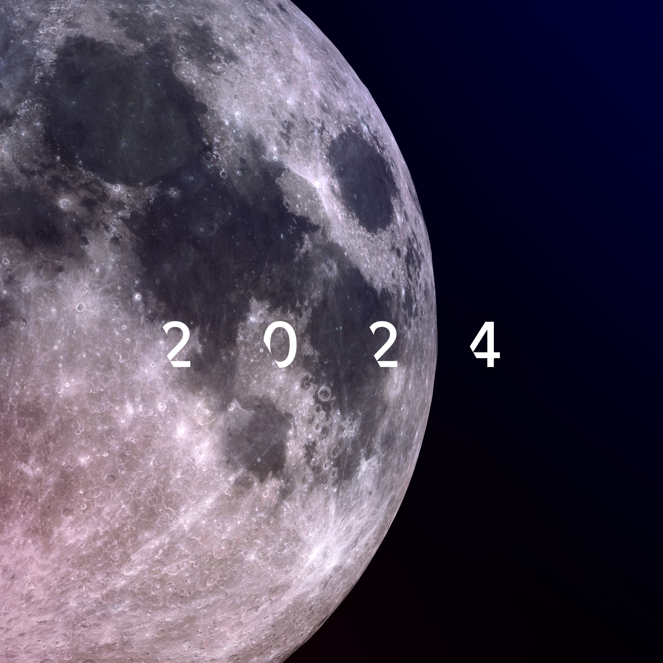
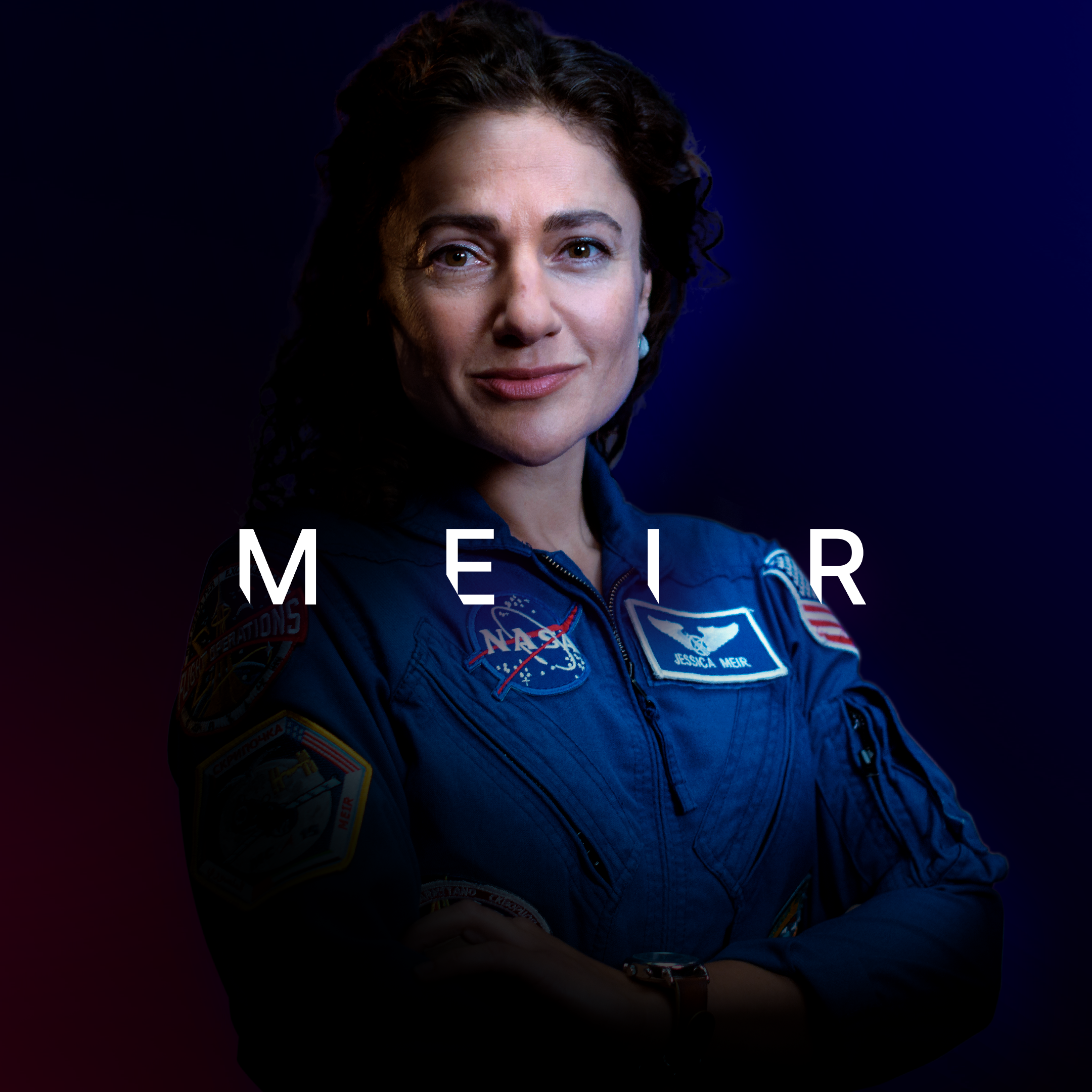
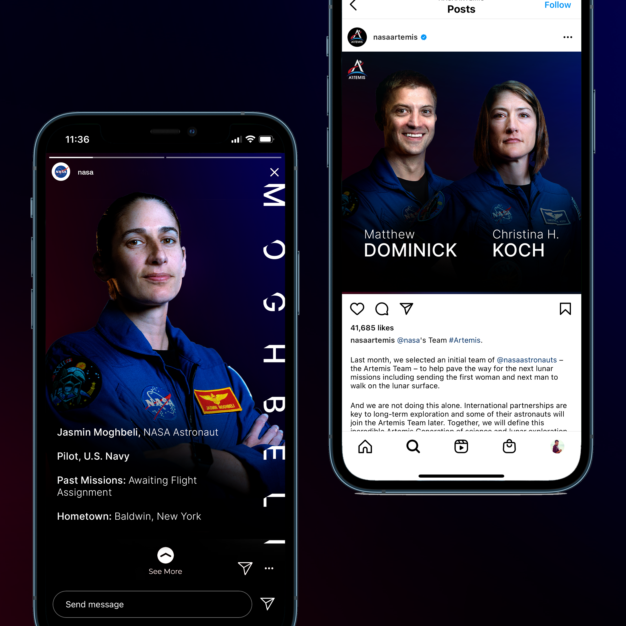
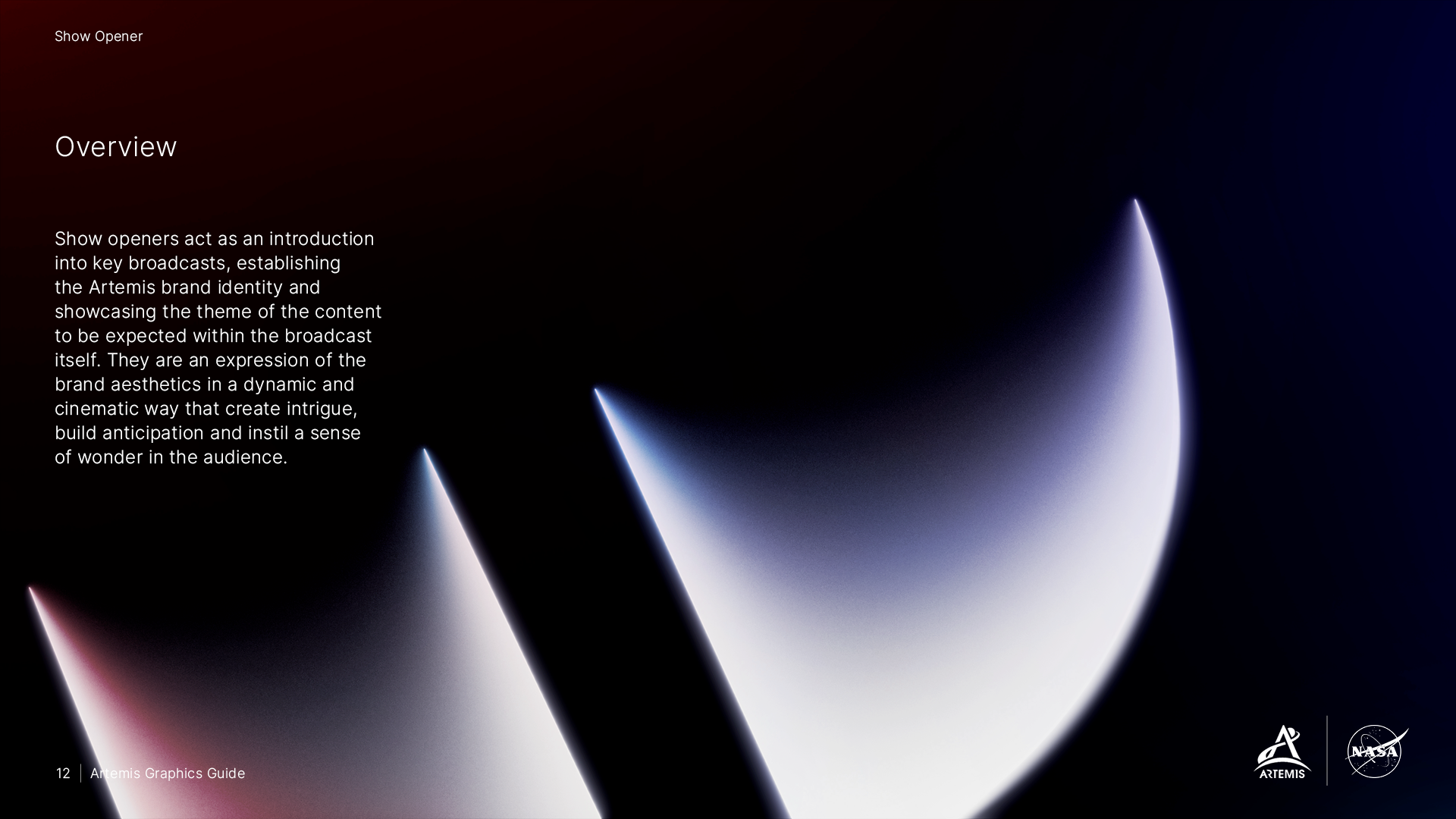
NASA’s next moon programme, Artemis, is set to take the astronauts back to the moon, with the first female astronaut to set foot on the lunar surface. This identity package has a revealing light at its heart, illuminating the way forward through a journey of discovery that is so synonymous with space exploration.
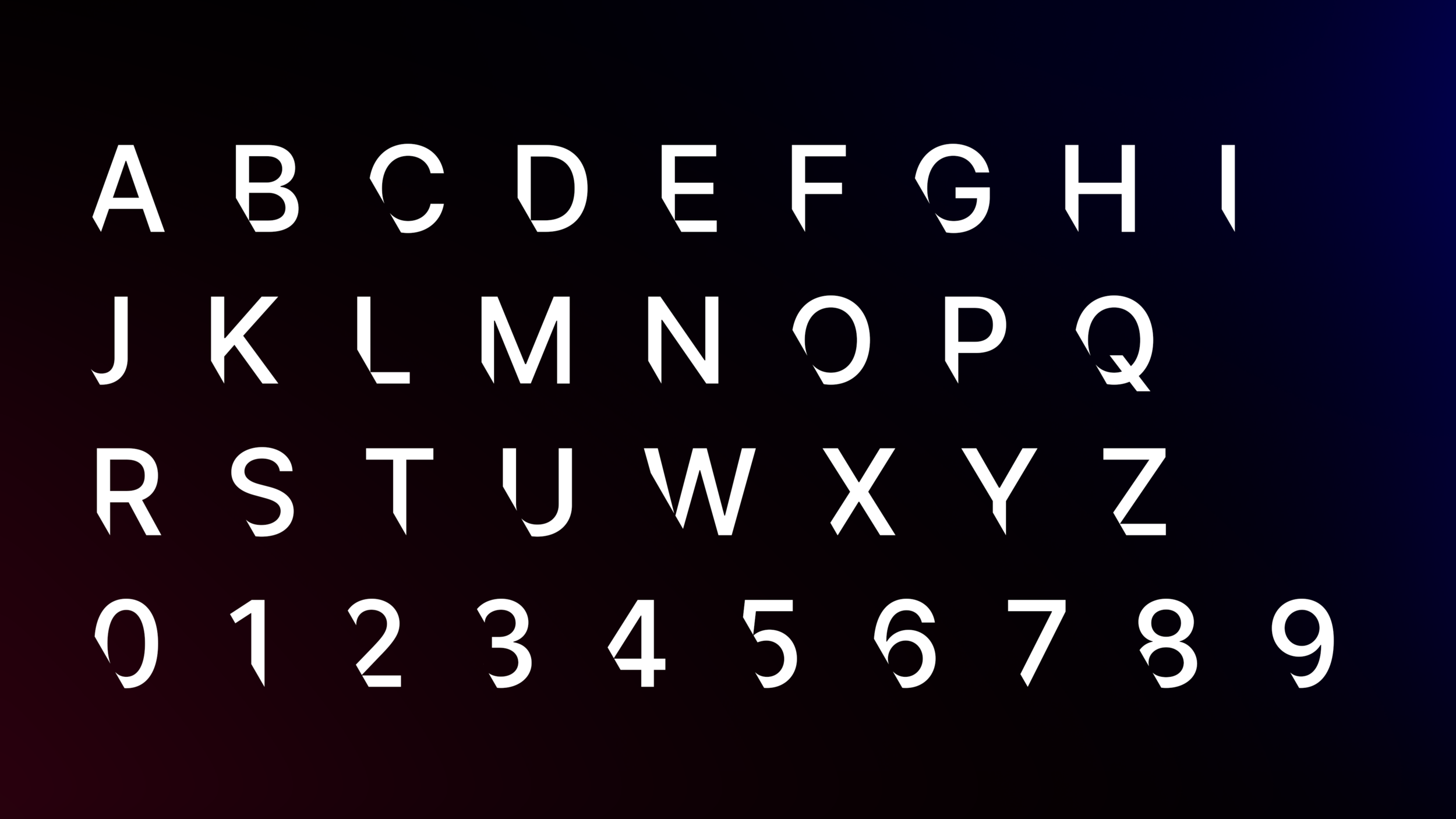
ARTEMIS TYPEFACE
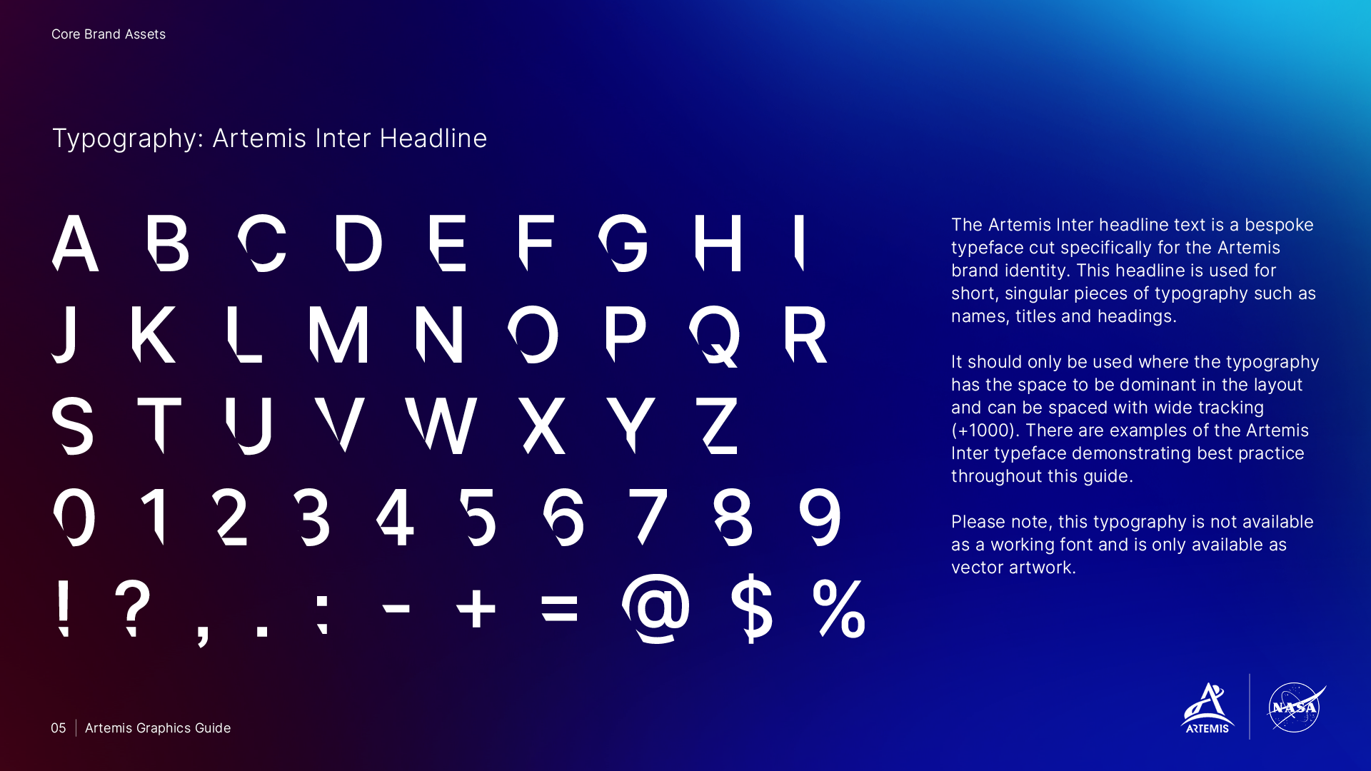
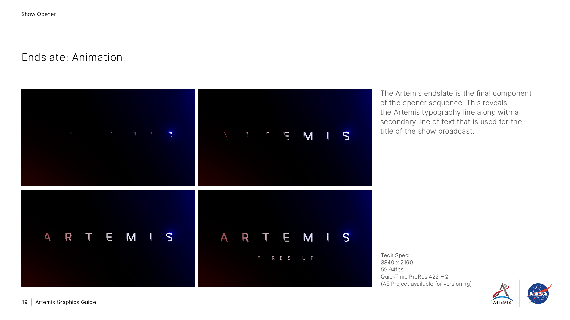
A key feature of the visual identity is a crafted bespoke typeface with each character cut to reference the angle of the Earth’s axis.
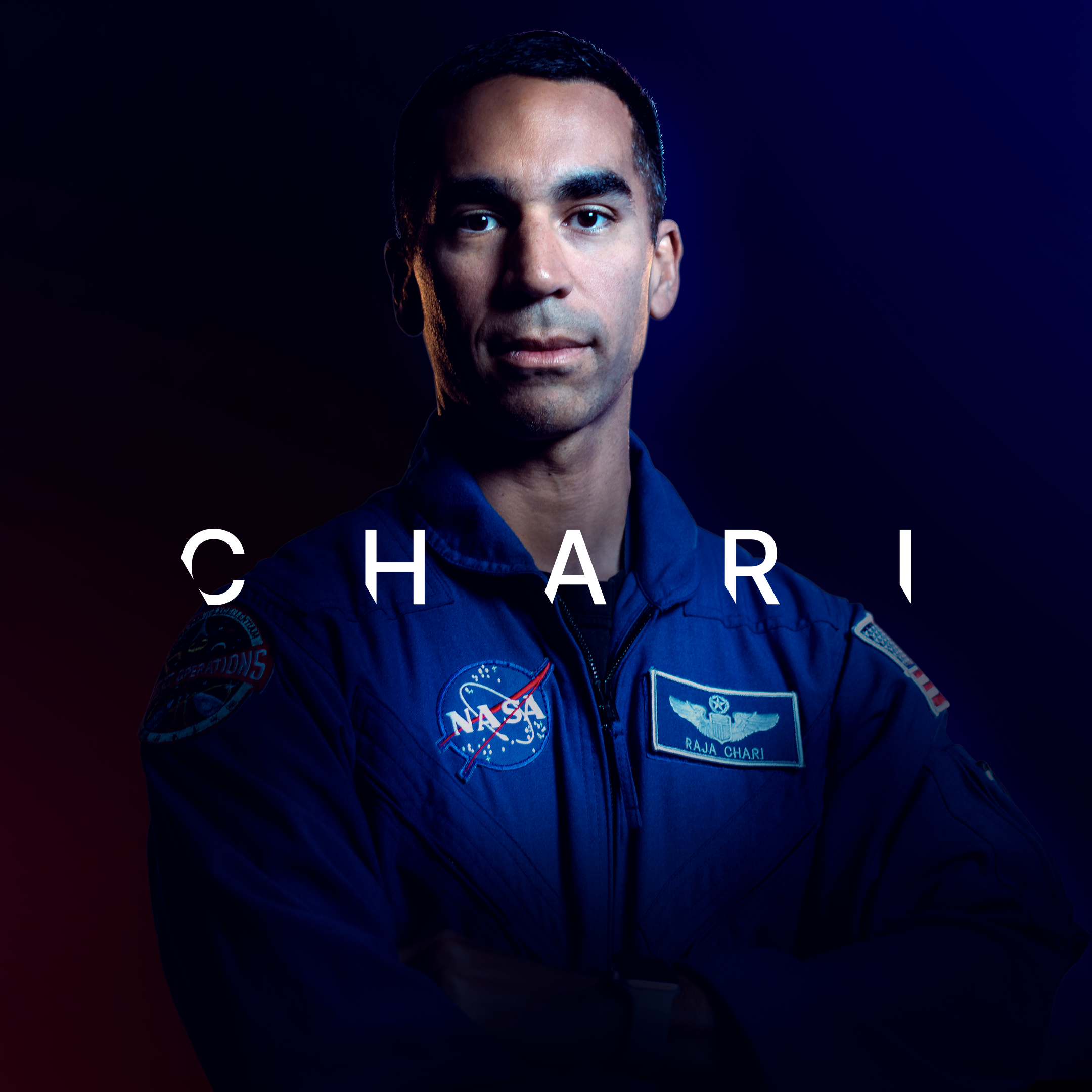
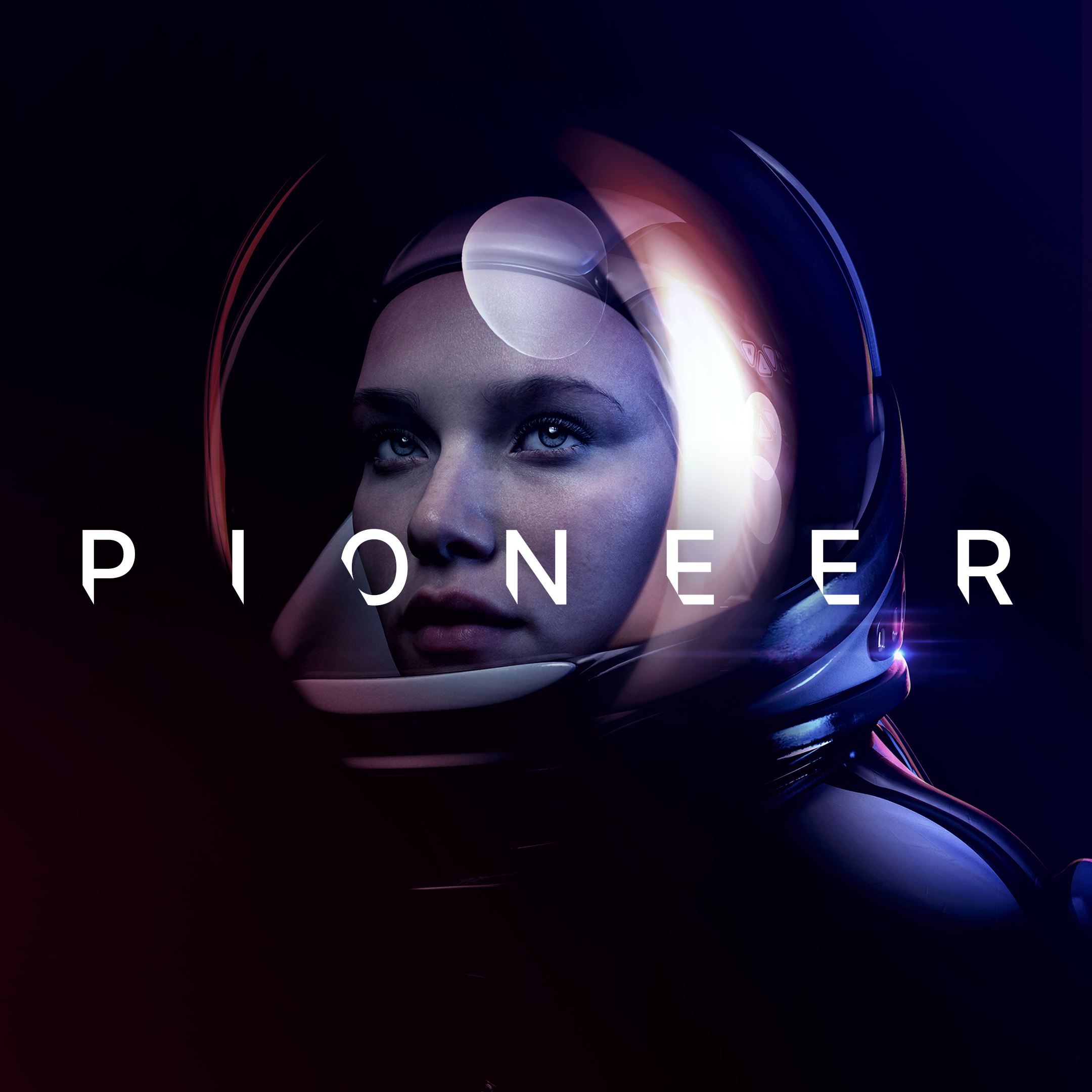
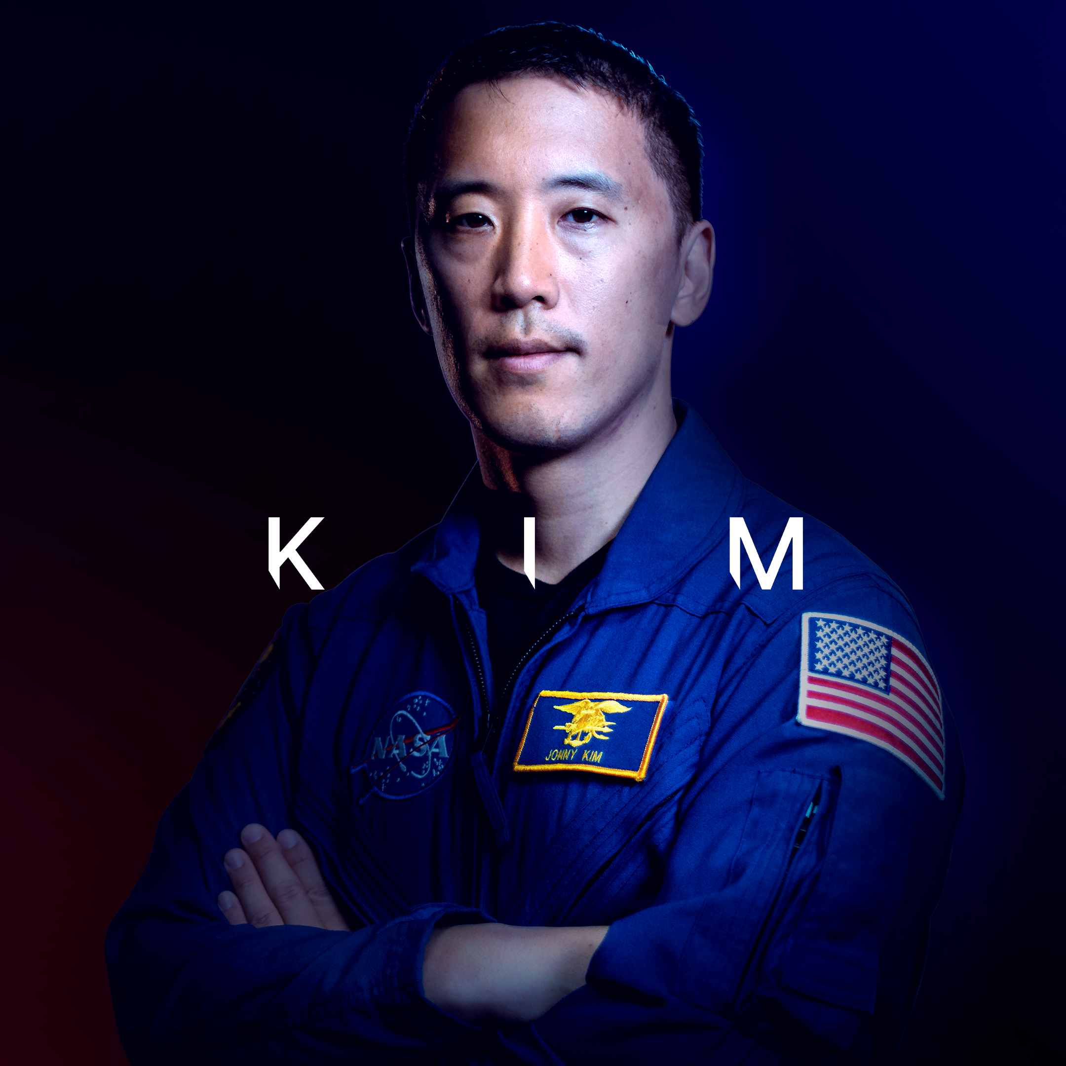
This asset is used across all brand touchpoints ensuring a dynamic and cinematic approach is applied to key messaging and titles.
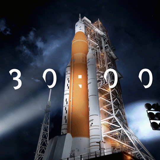
ROCKET VISUALISATION
The Space Launch System (SLS) is the new launch vehicle developed by NASA to become the primary vehicle for deep space exploration throughout the Artemis program. To demonstrate the capabilities of this feat of engineering, a stylised rocket visualisation was created to explain the key features of the rocket, from its iconic orange core stage storing the fuel, to the four RS-25 engines that will propel the vehicle into space.
BRAND GUIDELINES
Detailed brand guidelines were created to communicate principles of the design system and the application of assets. With a huge organisation such as NASA it was crucial to ensure everyone could easily understand the brand identity and identify ways to bring it to life in their respective areas.

CREDITS
Collaboration with Superunion
Executive Creative Director: Stuart Radford
Motion Designers: Ed Fergusson, Rich Pizey
VFX Designer: Joe Maker
Production: Sophia Pendar-Hughes
Account Management: Suzanne Neal